Fitting the width of web page that has long formula to display size
The width of my WordPress blog doesn’t fit mobile display. What is the cause? How can I fix this?
GOAL
To adjust the width of pages in my WordPress blog for mobile phone.
Environment
WordPress 5.5.1
Theme: Sparkling
Plugin: MathJax-LaTeX
Cause
The page size is expanded by mathematical formula. (For example, an article “What is Hermite interpolation?” has long formula)

How I found it…
In my case, though the width of main html is fit to the display the width of the whole page is expanded for some reasons. And it doesn’t occur when single article is opened (you can see the size of background is fit to the display as below).

I found that the change of the width happens with a time lag after main header and footer are loaded. I captured display and find that the change happened just after “Typesetting math” process completed.
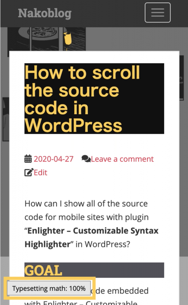
This process is creation of the formula with the greatly useful plugin “MathJax-LaTeX“. When “MathJax-LaTeX” plugin is deactivated, the size of the page fit to the display.

Methods
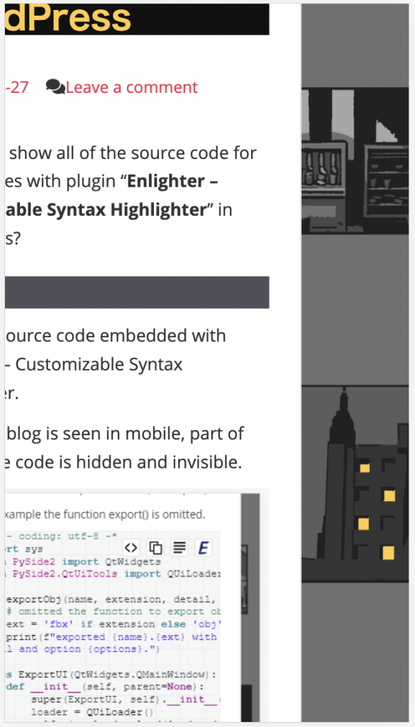
The following is html source related to MathJax.
<p>
  <span class="MathJax_Preview" style=""></span>
  <div class="MathJax_Display" style="text-align: center;">
    <span class="MathJax" id="MathJax-Element-6-Frame" tabindex="0" style="text-align: center;">
      <nobr>
       ------ omitted ------
Workaround currently is to add the css below to the “Additional CSS.”
.MathJax_Display{
	height: 55px;
	overflow-x: auto;
}
This enables formula with MathJax-LaTeX to fit the width of page and be scrolled with scroll bar.